NATIONAL INSTITUTE OF HEALTH
•
SHIPPED 2024
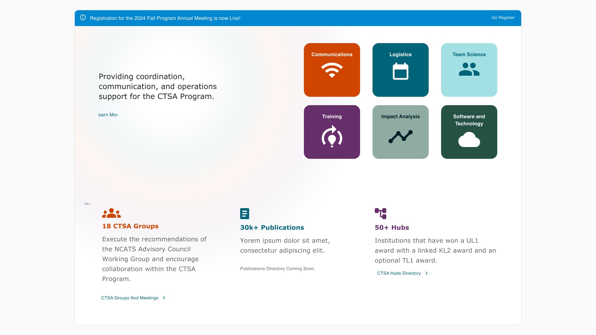
Communications portal redesign
TEAM
2 designers
4 developers
1 project manager
1 product manager
ROLE
UI/UX Designer
CLIENT
NIH (National Institute of Health)
TIMELINE
January 2023 - August 2024 (1 yr. and 7 mo.)
BACKGROUND
The National Institutes of Health (NIH) needed a new website portal for their Clinical and Translational Science Awards (CTSA) Program.
To address this, the NIH brought together a cross-organizational team that included Gryphon Scientific to create the new portal. As the UI/UX designer for Gryphon Scientific, I led the end-to-end UX and UI design for this new communications web platform.
PROBLEM
The original CTSA communications website was difficult to navigate, visually fragmented, and ineffective at helping users find key information quickly. 31K+ active users experienced difficulty signing up for events, collaborating with working groups, and staying informed on program updates.
SOLUTION
I worked closely with the development team, project manager, and key stakeholders to lead the new design of the web portal, bridging the gap between scientists, clinicians, and the research program.
IMPACT
The new website transformed the way members engage with the CTSA program, proven by it's doubled user engagement and 80% higher conversion rates. The website improved the overall collaboration for the entire program and each of its working groups. We received positive feedback from both the users and our client, praising the website as being clean, modern, and easy-to-use.
APPROACH
Auditing the Existing Website
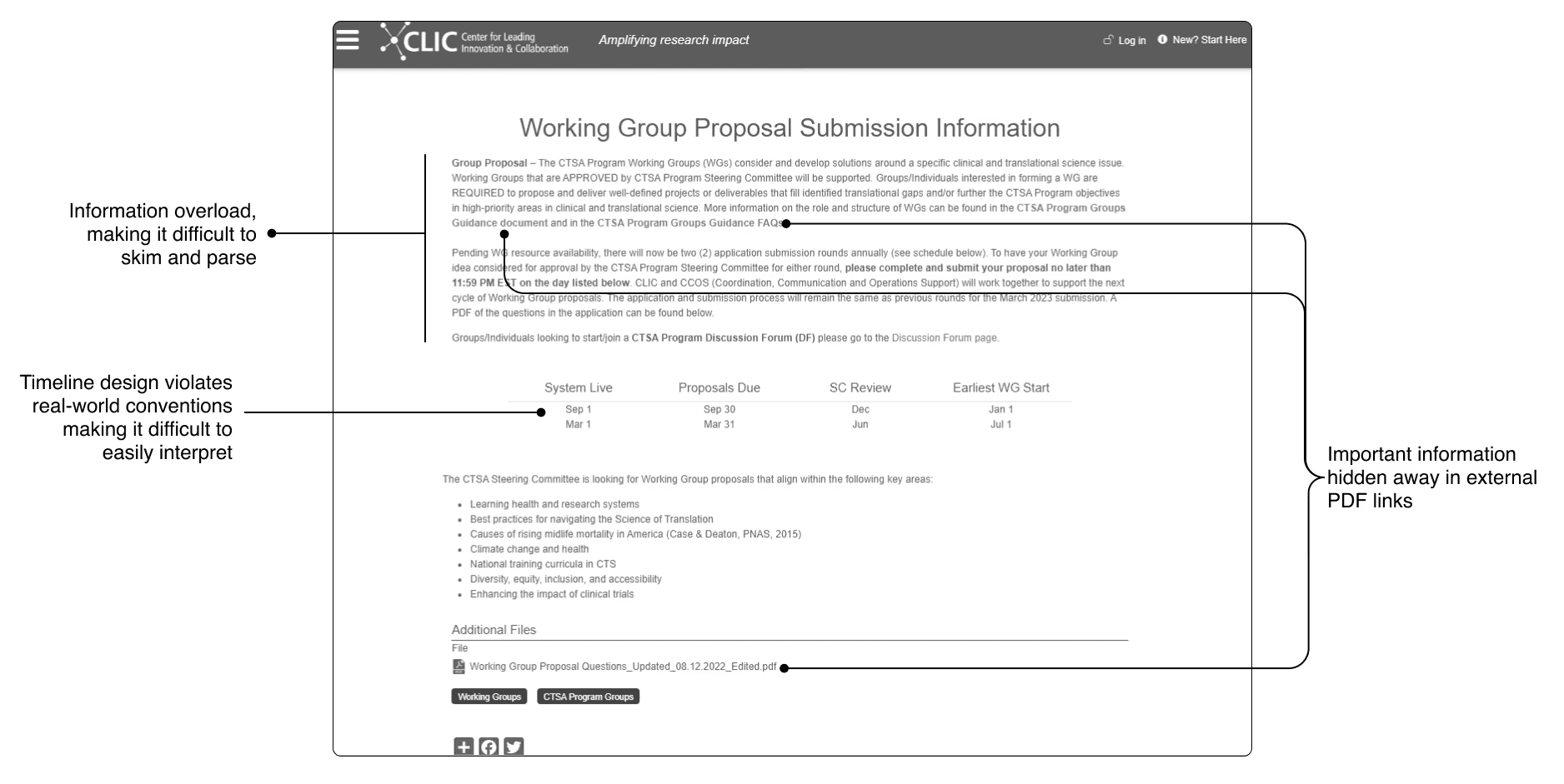
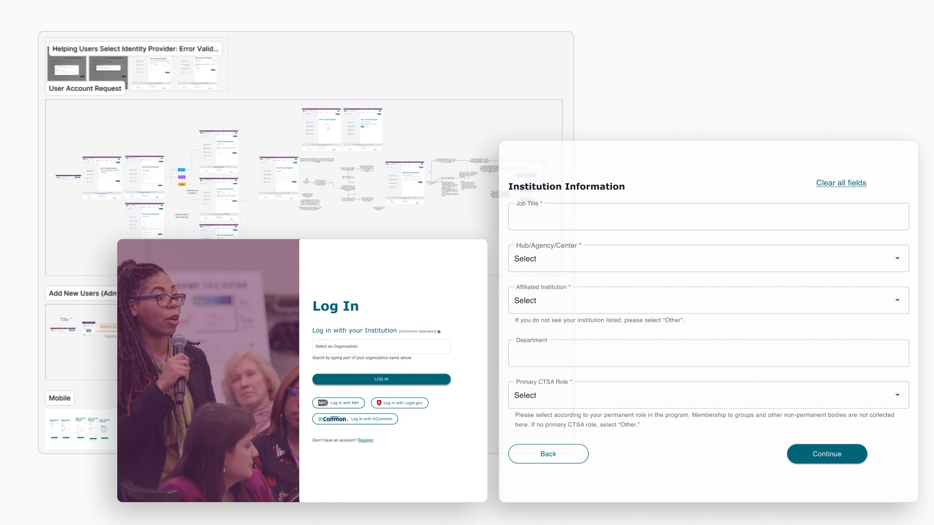
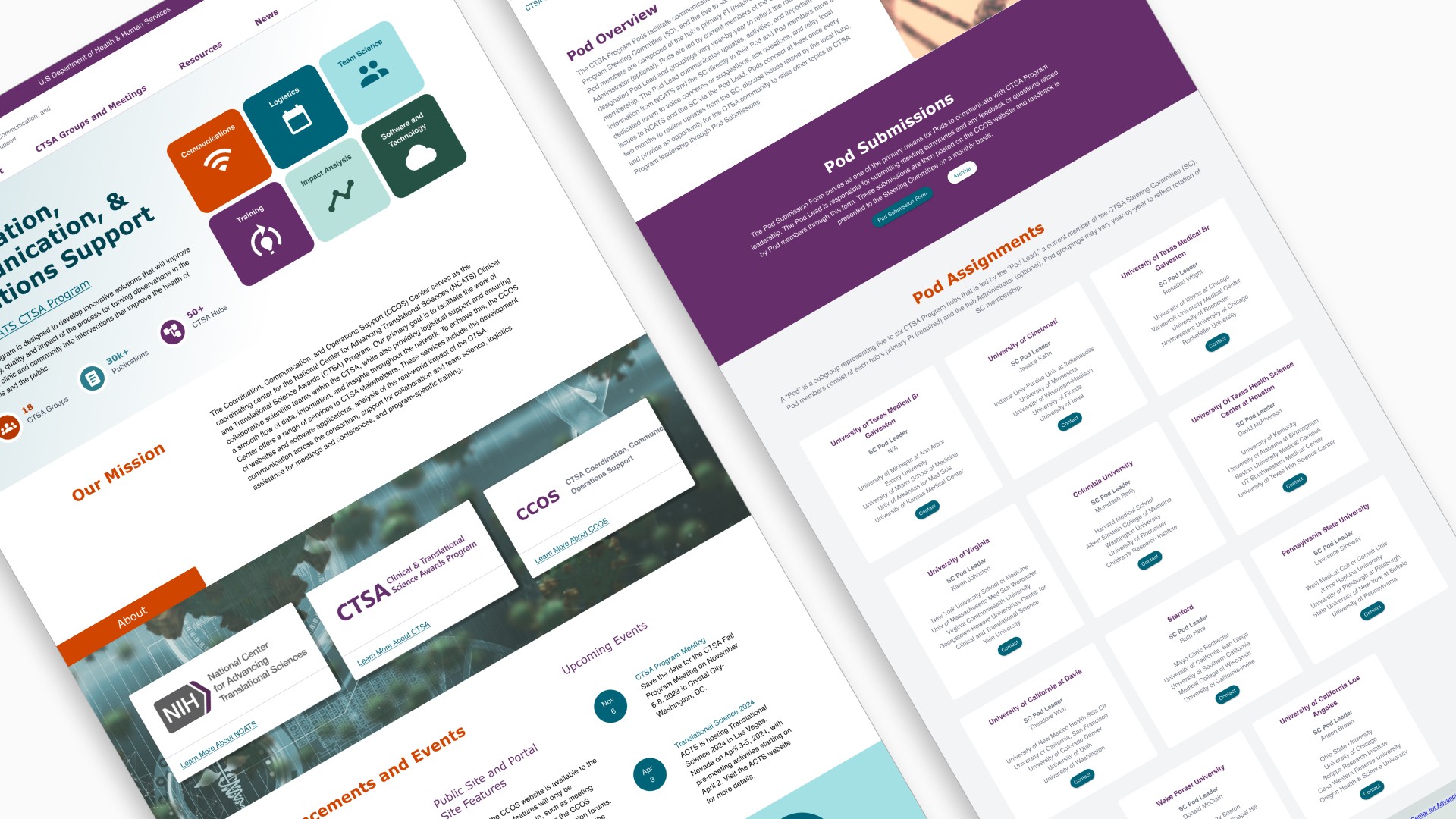
Original submission form
Key issues with the original website portal:
Little to zero ways to foster collaboration (acted as more of a website than a web portal).
Users lacked the ability to find specific information.
Pages were buried under multiple layers of navigation, making it difficult to find.
Content, organization, and layouts were inconsistent.
I designed a new site map to layout all of the information needed on the website, and organized it in an intuitive way. This addressed users' discoverability issues and eliminate unnecessary complexity in the navigation.

New Site Map
Understanding Users Through Stakeholder Relationships
Stakeholder conversations became invaluable to developing a better understanding of nuanced user needs.
I learned:
How to ask stakeholders the right questions
The pain points users faced with the original web portal
The history and politics behind outdated design decisions
What the content team needed to share on the website
What engineering constraints I needed to consider in the designs
Defining the Key Users
Each group had different goals, but all shared the same core need: a clean, intuitive way to find what they were looking for.
The Researcher
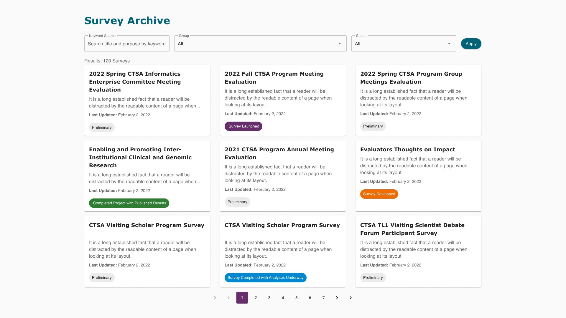
Scientists looking to stay updated with the latest research news and events, relevant to the topics they care about. Need to easily sign up for webinars and program meetings.
The Working Group Leader
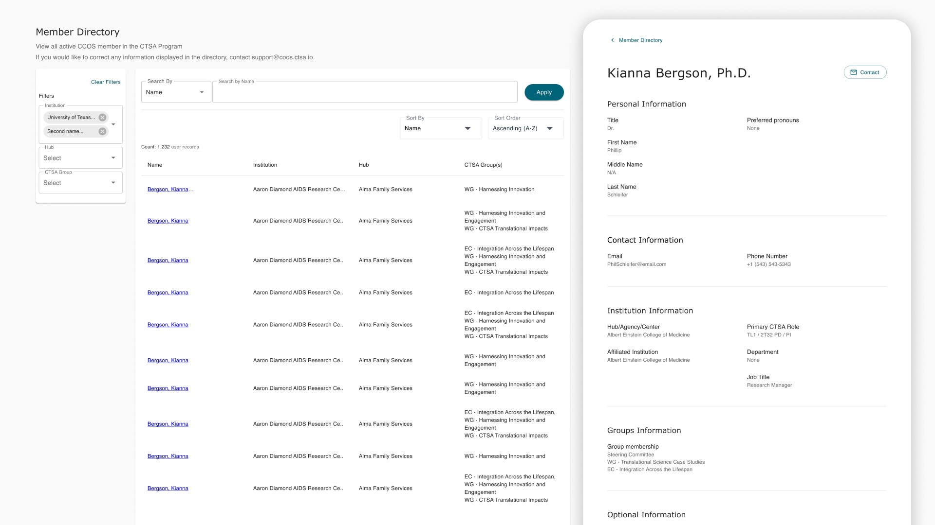
Want an easy way to manage their groups and stay connected. Need to know exactly who their members are and how to contact them.
The General Member
More casual members of the consortia. Need to easily find general resources that quickly provide the answers they need.
Making Our Figma Workspace User Friendly
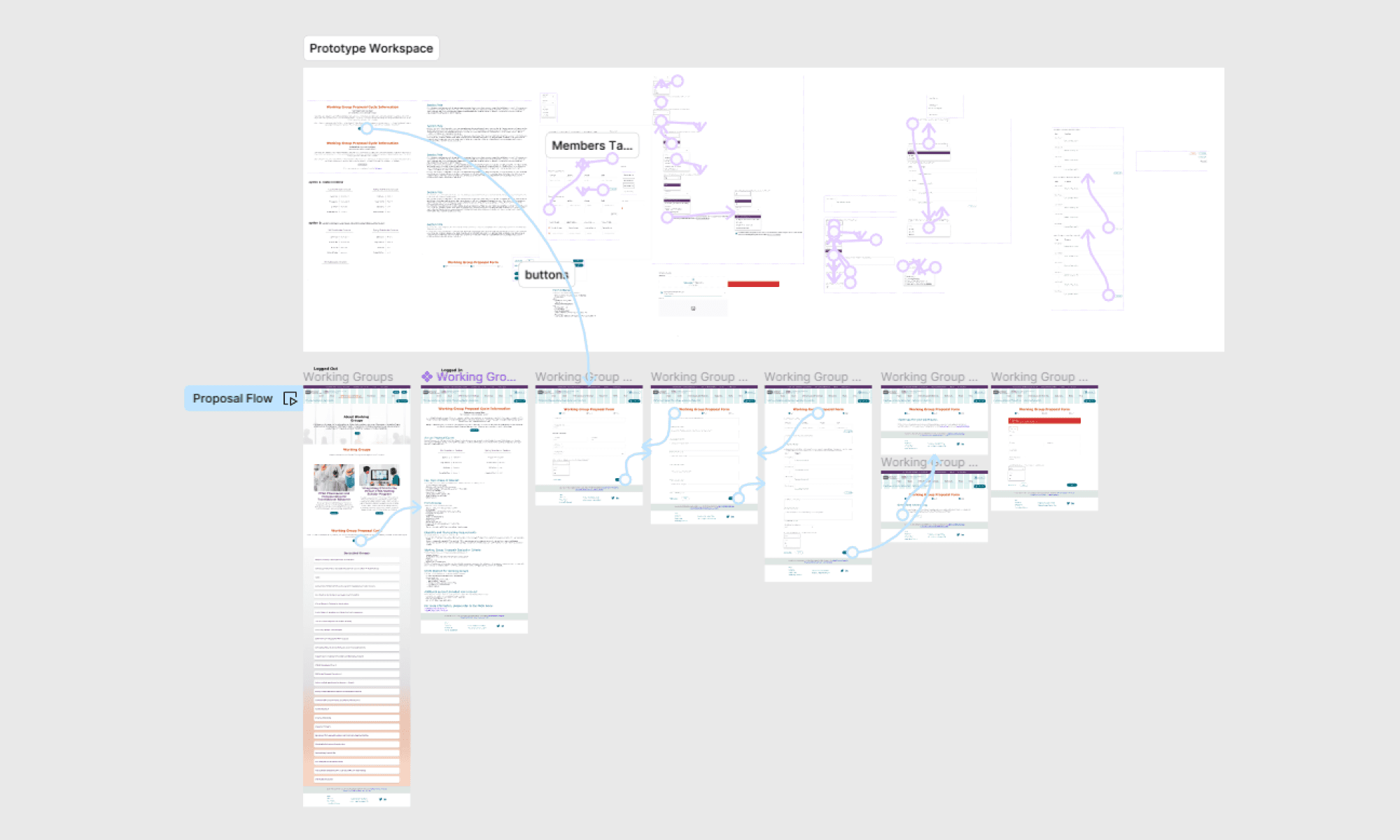
The design file was set up by a non-designer who was new to using Figma. Designs suffered from poor consistency without any reusable components. Stakeholders and engineering team had difficulty navigating the file to find the correct designs for the current release. This resulted in precious time spent tracking down the correct file link.
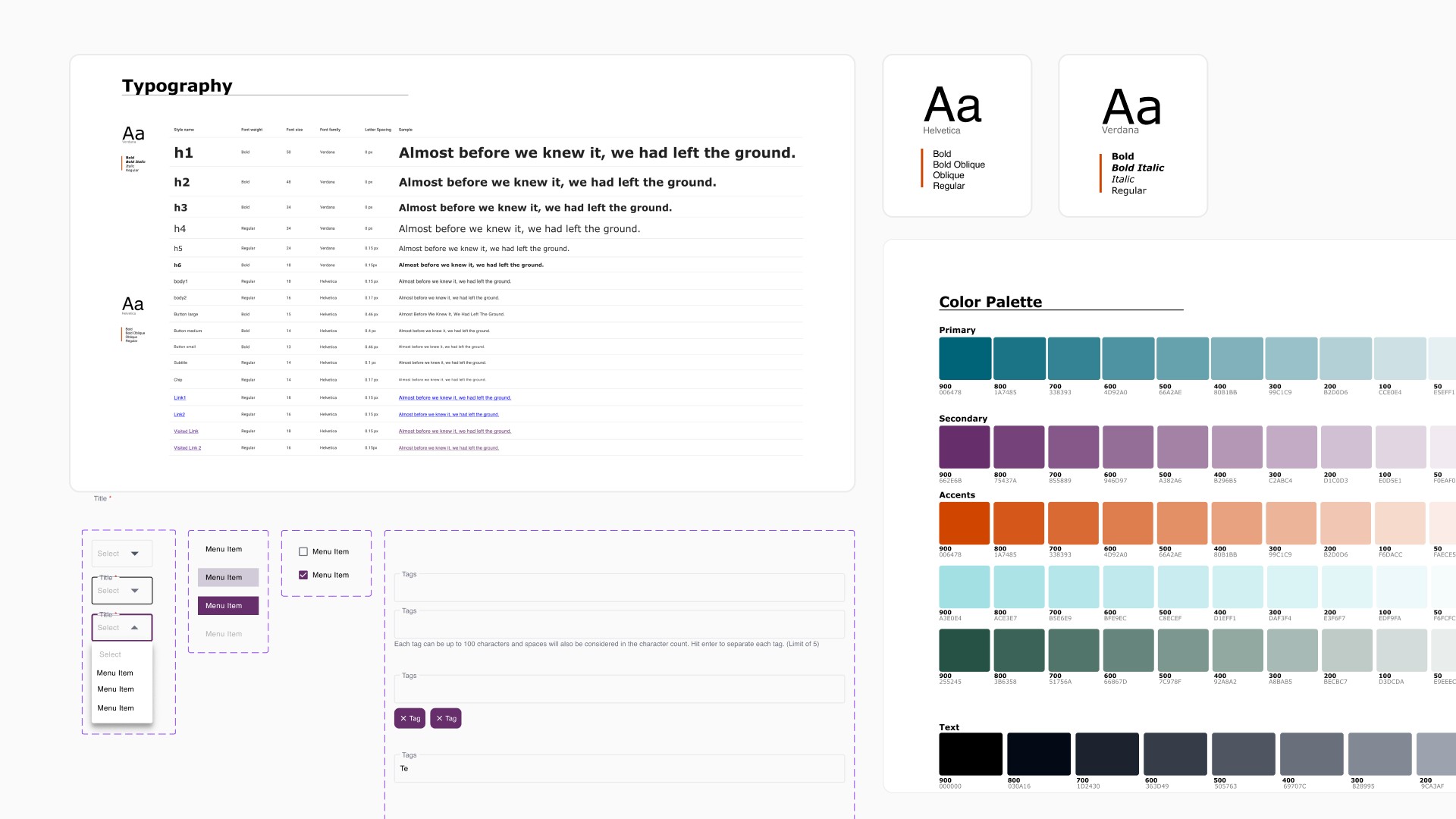
I took the lead in owning the new initiative to transform our Figma into a scalable and easy-to-use workspace for all teams:
Created a design system from the ground up.
Got Section 508 certification and conducted a redesign to ensure the website followed Section 508 and WCAG AA standards.
Built reusable components for developers.
Reorganized folders, pages, and established a file structure hierarchy.
Introduced naming conventions for frames, sections, and version history.
Restructured the file by release cycles.
Reorganizing files by release was a game changer. It dramatically improved ease of navigation because it aligned with stakeholder's mental models. With a reusable design system, developers no longer needed to create new components. It was already built in the system.
This Figma overhaul solved a major source of internal friction and became a critical asset for the entire team, improving efficiency and decrease design and engineering time by at least 20%.
DESIGN
The Design Process
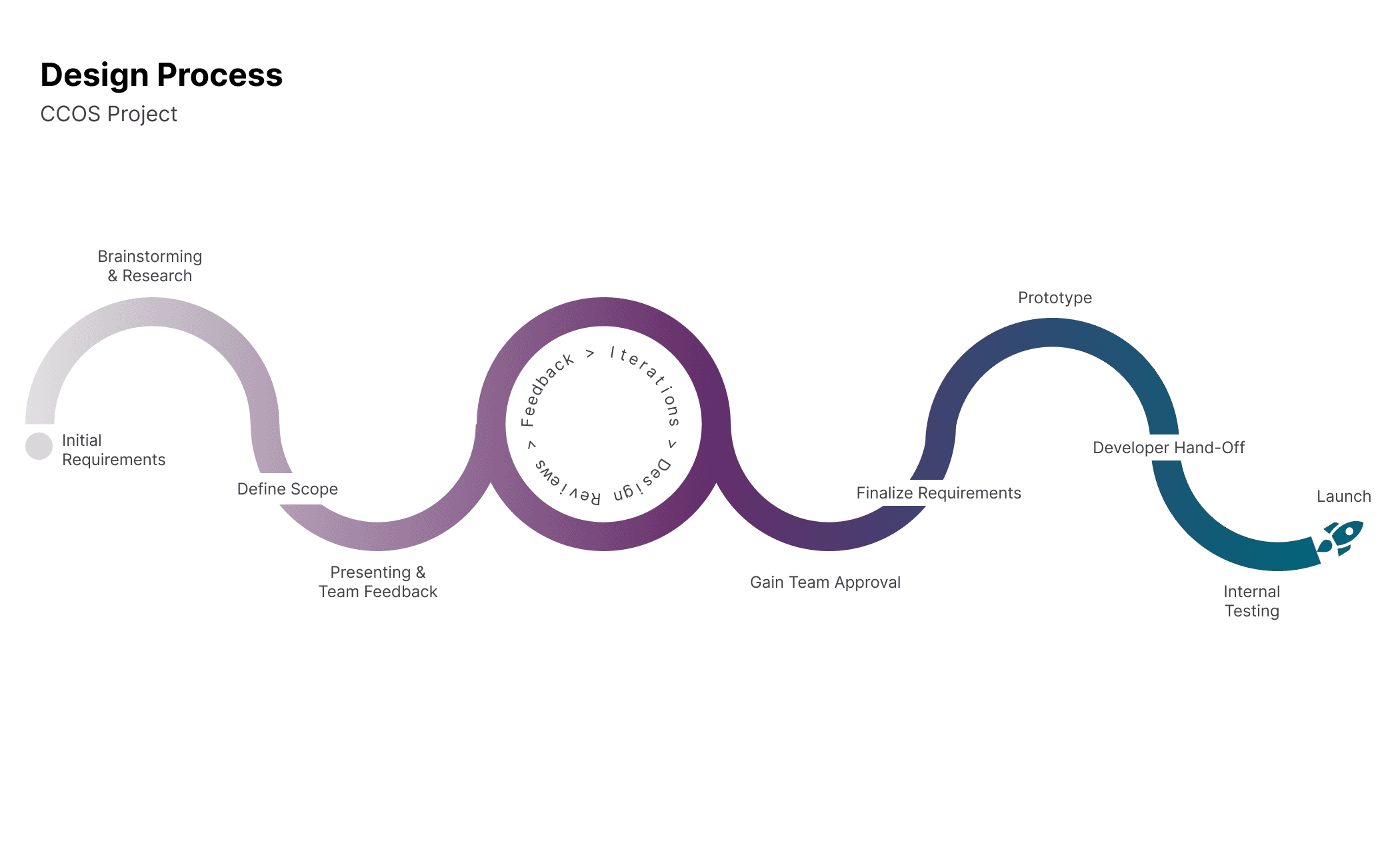
Design Process
Leaders give stronger feedback when you give them something tangible they can react to.
With boxes, gray colors, and placeholder texts, I realized the program's stakeholders weren't able to visualize these solutions. We had to go through redesigns too frequently and this caused delays in the timeline, worsening the overall design quality of our product. I decided to bring in higher fidelity designs to them sooner in the cycle.
That's when conversations became more livelier.
I used the design system I had created to bring high fidelity mock ups to leadership in quick turnaround times. I set up guardrails by providing two viable design options, and this transformed the flow of these meetings. The ability to pick between option A and B encouraged stakeholders to give clearer, more valuable feedback.
The new method made our design critiques more helpful in identifying missing product requirements, gain valuable feedback from stakeholders, and achieving buy-in from everyone.
We were now able to ensure the designs
Worked for the user
Integrated with the rest of the website
Supported the CTSA program’s goals
Accessibility issues were found throughout the site.
We brought in an accessibility expert to audit the website for compliance. The results revealed several Section 508 compliance issues in both the front and back end.
To address this, I:
Completed a certification on Section 508 accessibility
Provided actionable recommendations to engineering
Updated all future designs to ensure:
WCAG AA color contrast
Assistive technology support such as screen readers
Accessible components and interactions
Accessibility was now integrated in the design process, instead of being an afterthought. This improved efficiency by reducing rework and improved usability for all users.
IMPACT
How better user experience strengthened the program's collaboration and connection.
By the end of the redesign, we benchmarked with the previous web portal. Insights showed:
Overall user engagement doubled (Session duration, Retention rates, User registration, Click rates).
Conversion rates increased by 80%.
Navigation performance dramatically improved.
Bounce rates decreased across key pages.
Substantial decrease in drop off rates during new onboarding user flow.
These were direct comparisons against analytics from before and after my involvement.
User and stakeholder feedback included:
“Much easier to navigate.”
“Cleaner and more modern.”
“Everything is finally where I expect it to be.”
And engineering and content teams also reported smoother collaboration because of the improved design system, easy hand-offs, and productive review processes.
LESSONS LEARNED
This project taught me some of the most important lessons of my UX career:
Strong relationships lead to strong insights. Understanding stakeholder needs was a window into understanding users, which was essential without user research.
Process is a product. The Figma file and the design workflow I established became just as valuable as the redesign itself.
Good design requires advocacy. I learned how to gather productive feedback and master the art of knowing how to ask the right questions.
Accessibility saves money, time, and the product. Building it into the foundation elevated the entire experience.
Most importantly, I learned how to work alongside a large, multi-disciplinary team through a design process that put users and clarity at its core.
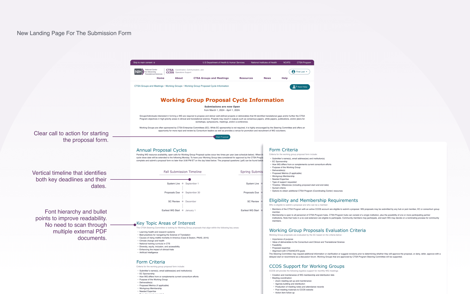
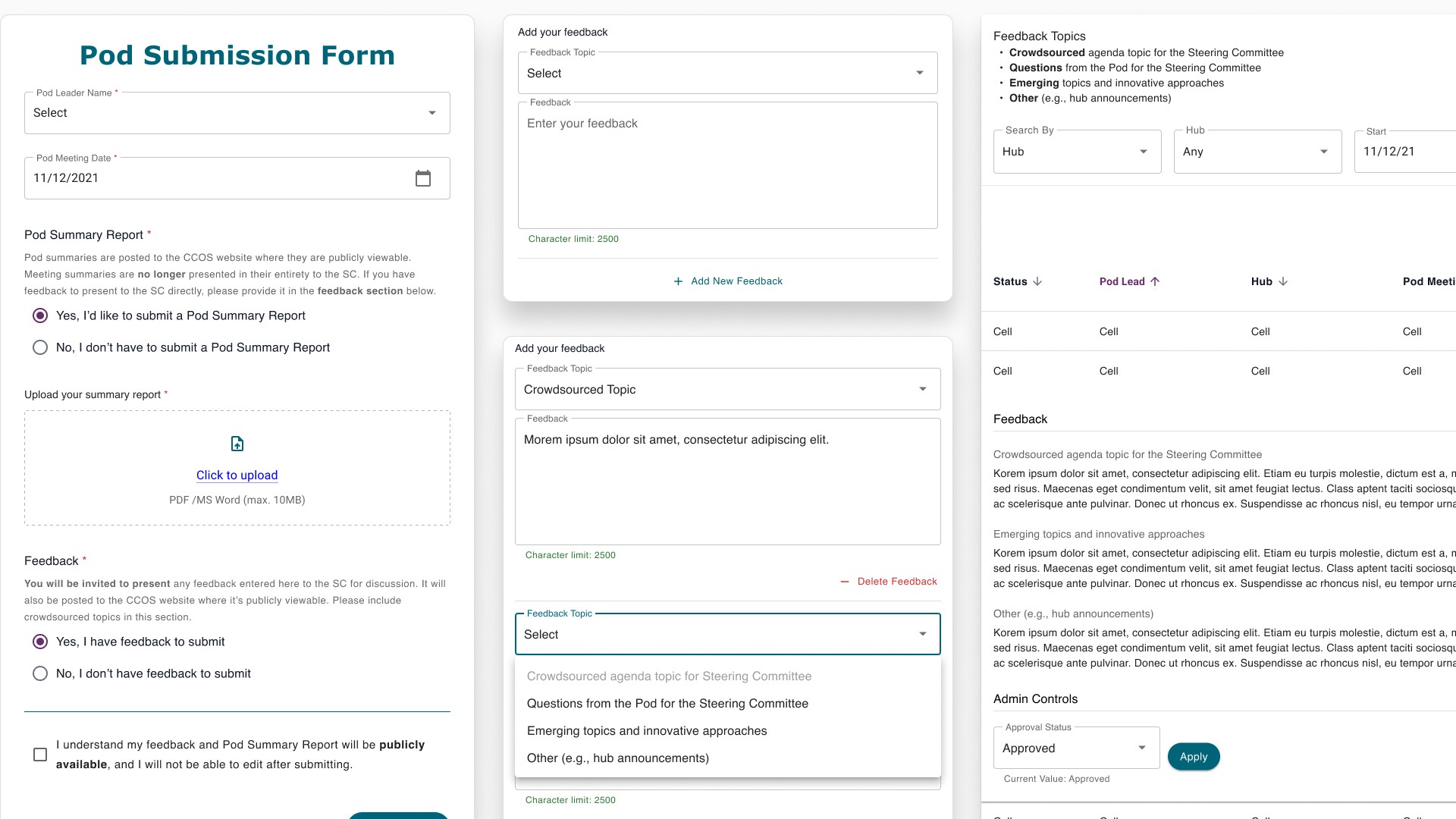
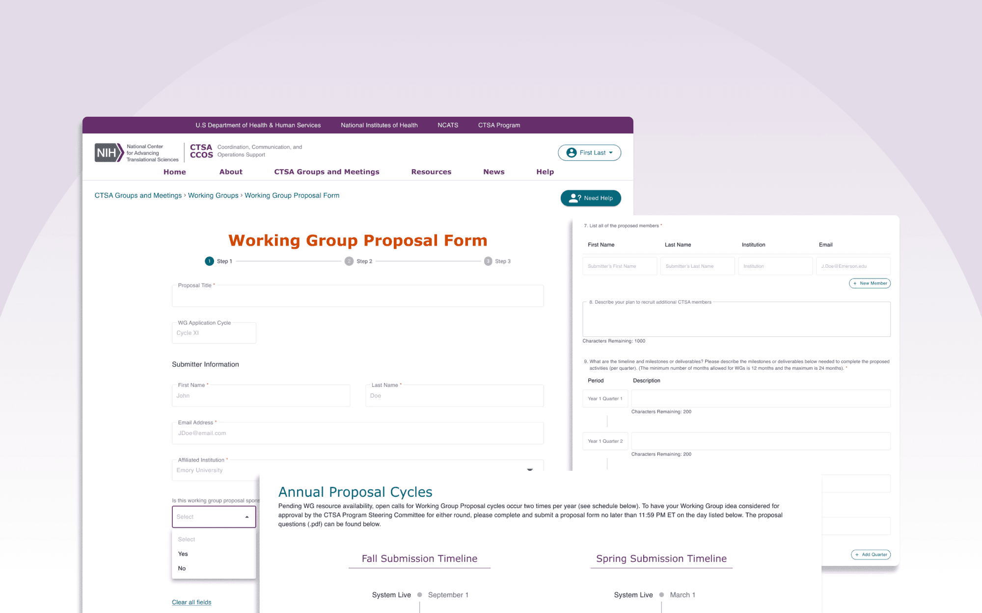
Redesigned submission form
Next Project
Inventory Management Tool
